
Images shot on JCH Street Pan 400 in the Yashica Electro 35 GSN
I’ve learnt a lot since I started shooting and writing for this website and it’s important for me to share some of that, in the hope it helps somebody else.
The two main points raised here might not be particularly enlightening if you’re further down the road than me, but that just means I’m not writing them for you.
Who they are aimed at are those just starting out and wanting some simple pointers on black and white, street, or film photography. Or all of the above.
If that’s you, read on. If that’s not you but you just want to see some shots taken on JCH Street Pan 400, also read on.

Contents
Black and white doesn’t mean just removing colour
When I first started shooting on my first half-decent camera a few years ago, my thoughts on black and white photography were pretty different to how they are now.
Back then it was a classic look and made street photographs more timeless. That was pretty much it. The problem though was in thinking monochrome can automatically make an image more interesting purely because of those adjectives.
There are of course countless photographs that look better in black and white than colour, but there are other reasons for this than just they’re black and white.
If you’re using monochrome as the main feature of your work, you’re probably not making the best work you could be. If you’re using it in post-processing as a tool to disguise shots that were boring in colour, you definitely could be doing better.
The best colour photography uses colour rather than simply being shot in colour, as we learnt all about here.
Similarly, there are certain elements you can use in your black and white photography that will improve it when compared to just shooting in black and white for the sake of it.
These include, but aren’t limited to, simplifying your work or giving it strong figure-to-ground contrast, using light and shadows, or reflections, repetition, and leading lines.
You can use all of these in colour photography too of course, but you kind of need them more in monochrome work as you have no option to use colour. They can also be more striking in this medium as there’s no colour to distract the eye from them.
To illustrate this point, the four photographs below were shot in monochrome but aren’t really using it or any of the composition elements above.
I don’t think they’d have been any more or less special had they been shot in colour. They’re just snapshots, really.


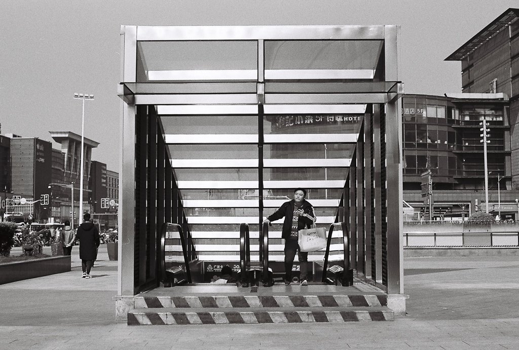
Using light, shadows and contrast in monochrome photography
While I didn’t get examples of all those composition techniques outlined above on this one roll of film, this next batch of images does show you some.
As mentioned, the photographs here were shot on JCH Street Pan 400. I’d already used some of the roll on the images in this piece and really just wanted to get it finished up and developed.
As Street Pan 400 has a reputation for high contrast results and I found myself free on a sunny Shanghai afternoon, heading out and looking for good light, shadows and contrast seemed a good way to go.
The subjects themselves became secondary, although as I’ve said many times before on this site, the subject of a photograph is always the light anyway. That’s something I learned early on this photography path.
Regardless, this goal dictated how I shot that afternoon. To look for nothing but the good light, and only when you see that do you think about who or what is in it, or is going to be.


Find the right film for your photography style
At the time of writing, there are around 200 different films you could buy and shoot. That number includes expired and discontinued stocks, which makes it impossible to put an exact figure on it.
Right now I’ve shot around 5% of them.
How different can they be, though? Especially the black and white ones? Aside from the different speeds – 100, 200, 400, 800 etc – how noticeable is any variation in one film going to be from the next one?
That’s something I was wondering before I started actually shooting and seeing for myself. And even where I am now on this path, which is not very far down it at all, I’ve learnt they can be pretty different indeed.
I didn’t plan for the first three monochrome ISO 400 films I shot to vary so much in the results they give. I didn’t read up or research. I just picked them for their price in the case of Kentmere 400 and Ilford Pan 400, and the backstory in the case of this Street Pan.
They all turned out pretty different indeed, with the Ilford 400 being really grainy and the Kentmere 400 being low on contrast.
This Street Pan 400 has little grain and higher contrast, and for those reasons is my favourite of the bunch. If I were looking for a single monochrome film to shoot a street project with, this would be an option. The other two wouldn’t.
I could probably have read the characteristics of these films online somewhere, but that’s no substitute for trying them out for myself. There’d still be some doubt in my mind about how accurate the information was.
If you’re new to this and don’t know which films match well with your style, there’s no better way than shooting a few and seeing which you like best.


So what have we learnt?
I’m usually better at not publishing two shots taken from the same scene but I really couldn’t decide which to choose from those last two. So I’ve gone with them both, for once.
Writing this post has been useful for me. It’s reminded me of some points and reinforced others. As said earlier, I’m hoping it’s been useful for you too.
To recap, whether you’re shooting film or digital, understand that great monochrome photography doesn’t happen just because it’s monochrome.
A lot of people prefer it to colour, but it’s not enough to simply shoot in monochrome if you want to reach your full potential.
Just as using colour is different to shooting in colour, using a few composition elements that bring out the contrast between the blacks and the whites in your shots will take it to the next level. Using good light is a big part of this.
Second, if you’re planning on shooting a film photography project and want it to have a consistent look, using a single film stock is one way to achieve this. What you don’t want to do is regret your choice after the project is finished.
You can research and read film reviews to get ideas, but there’s no substitute for trying a few to find one that you like more than others.
I think that’s what it’s really all about. Read no more than you need to, get out there, and #shootfilmmakesomething 🙂
If you found those two simple black and white photography tips useful and want to read some more analogue photography essays, why not have a look at some of these:


And if you think others will find this post worth a read, help them see it by giving it a share 😀
